
FLORTE Branding
Initially brought to General Store as a rebranding project, the client brief was to encapsulate the feeling of a “tea garden.” Their original branding was quite modern with photography used to show the different types of teas.
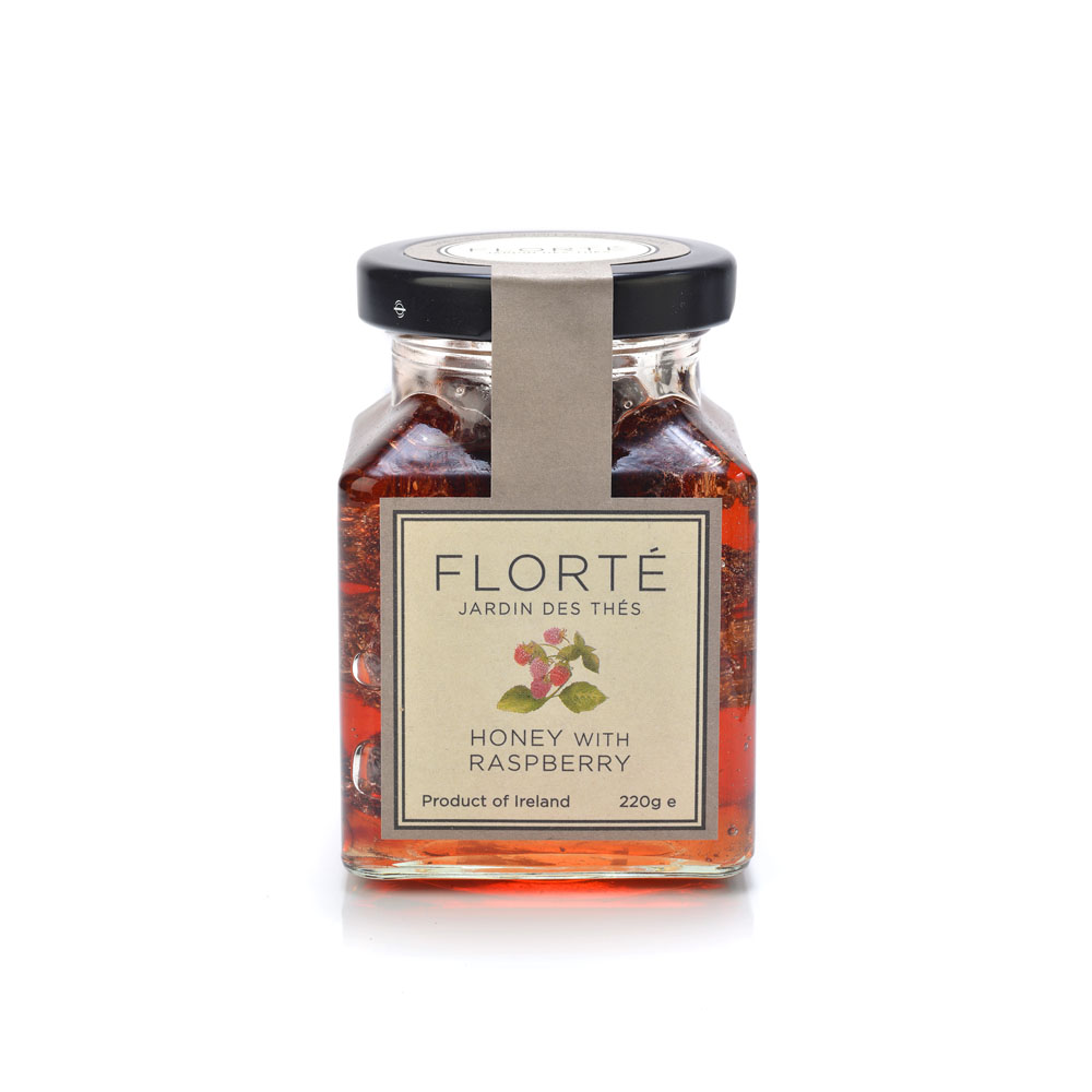
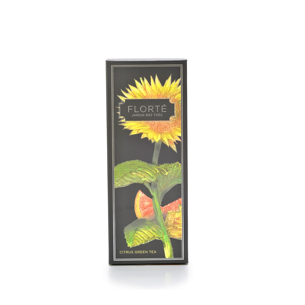
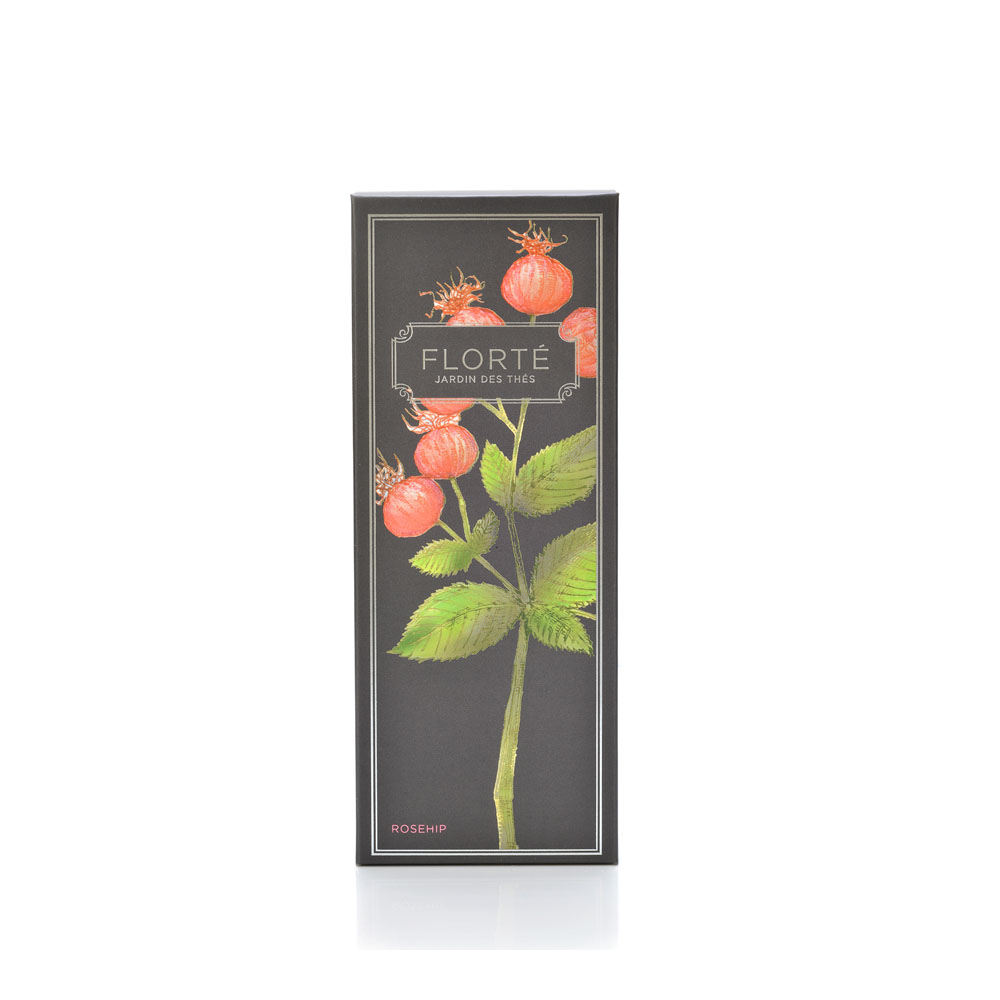
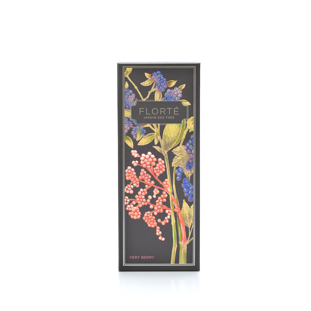
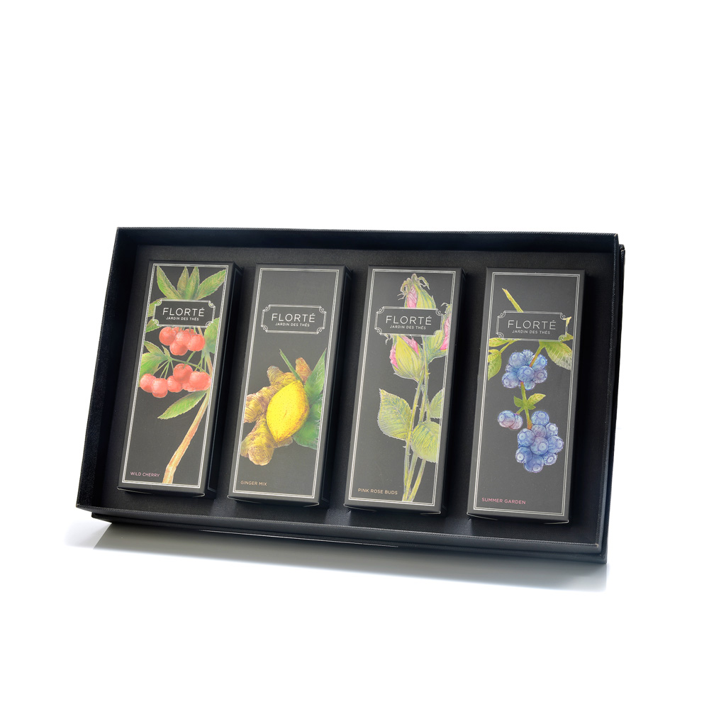
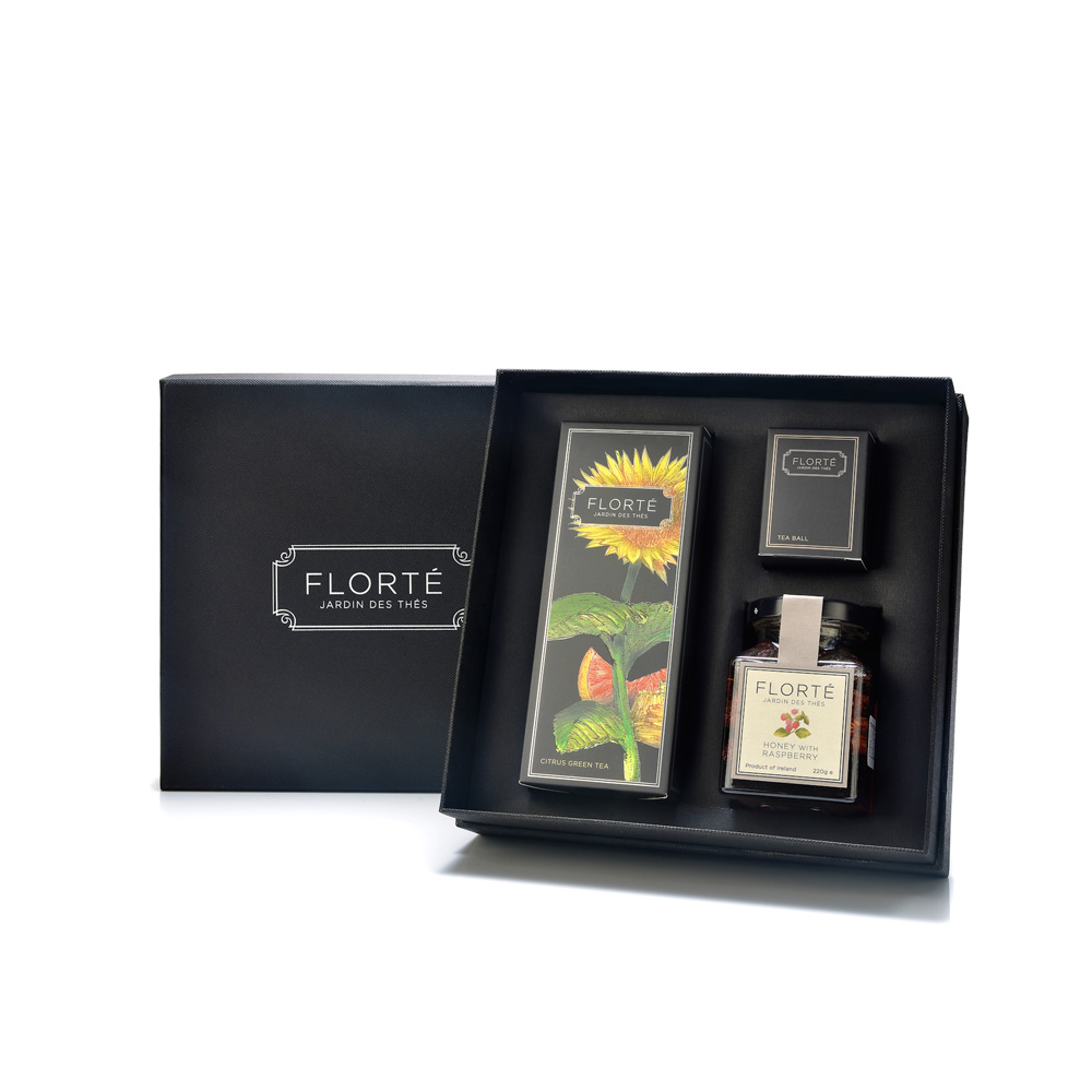
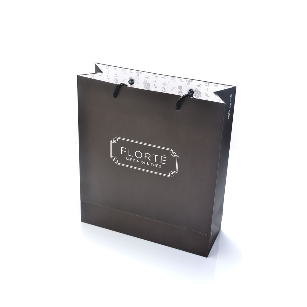
The vision of General Store took the branding to a more classic and sophisticated direction. We contracted an illustrator to hand illustrate each flavour of tea. Branding was developed to be modern but classic. The black packaging, printed on matt paper with pewter accents, well highlights the product and the illustrations appear to glow. Subtle color coding was used to differentiate the categories of tea.
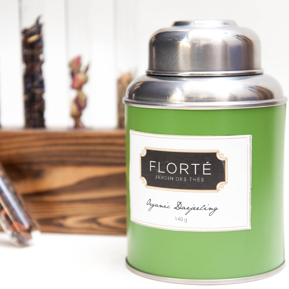
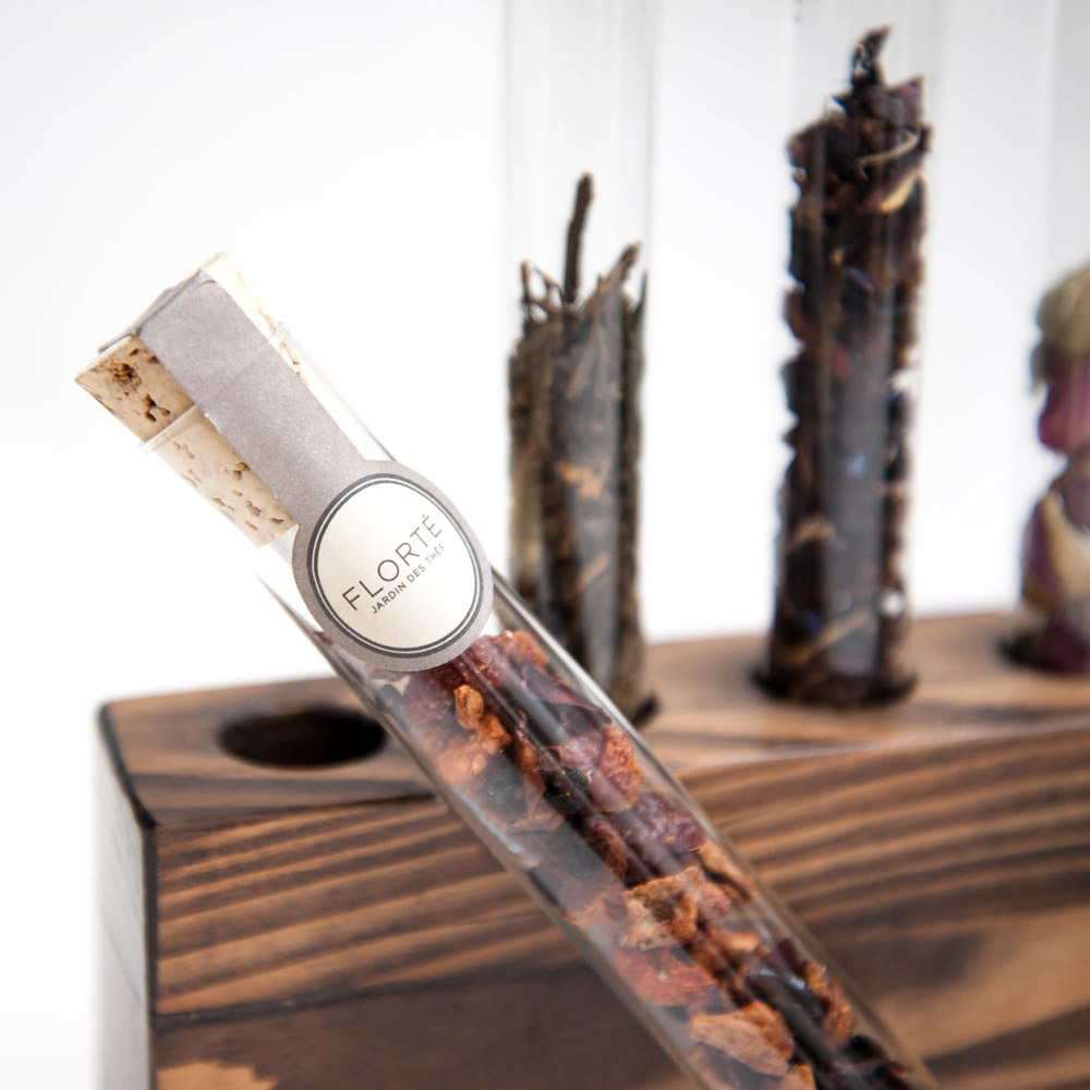
Further packaging included a General Store original concept – the Taste Tube. For clients unfamiliar with a loose tea product – we created a Taste Tube – glass cylinder packaging which beautifully shows the product and allows customers to try the product and different flavours. Also make a great gifting option.
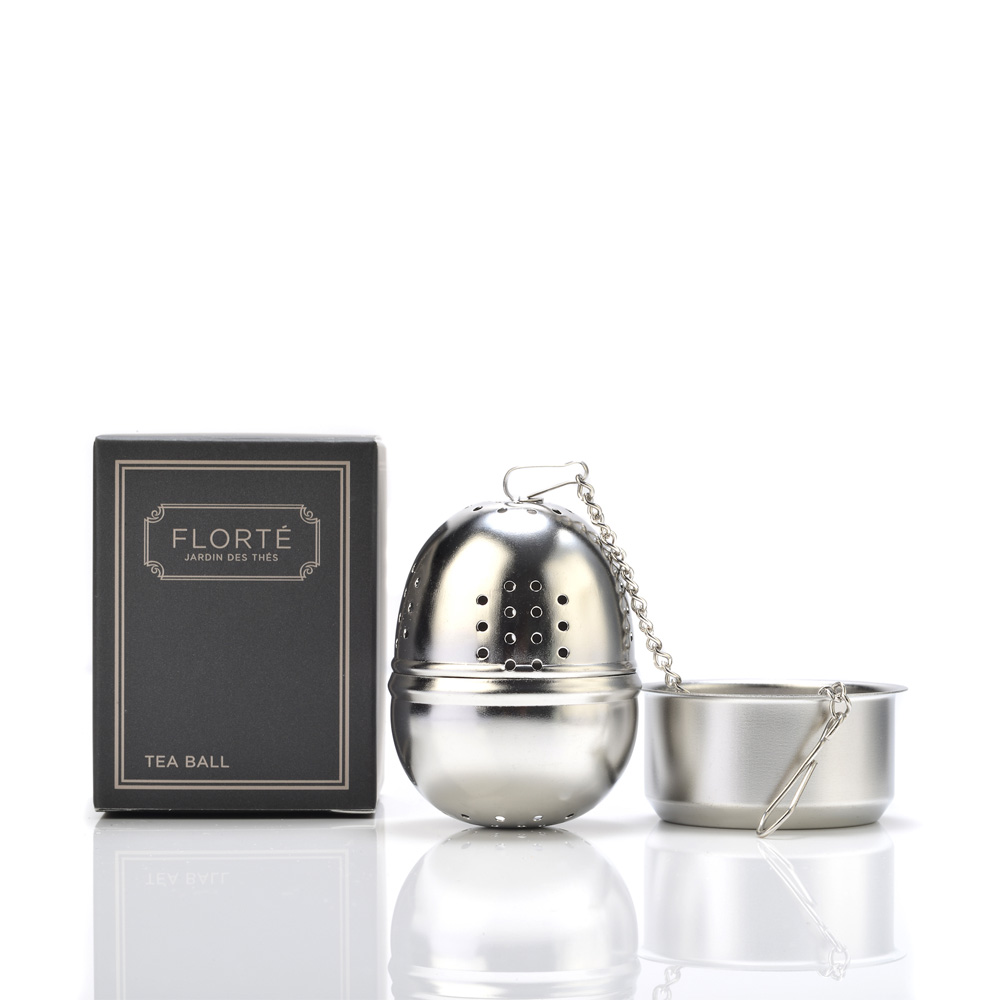
Further packaging created included but not limited to; staff uniforms, shopping bags, custom tins, miniature sized paper packaging, tea-ware packaging and gift boxes including ribbons etc.
This brand can be found at City Super, in their own stand-alone shops and other fine retailers.
